Mastheads
I have created four possible masthead designs and analysed how good they would be as a masthead. I outlined my choice at the bottom

I like this mast head design. The typeface is easy to read
whilst still popping out at the reader. The Gothic styling fits with the tone
that the magazine should set, and it also reflects the tone of the material
being discussed within the magazine.

The typeface in this design is much too ‘fancy’ and uses too
much embellishment. This makes it hard to read, so I am definitely not
considering using it as my mast head. I feel that it is so inconvenient to
read, that I will not be able to use the typeface anywhere in my magazine
whatsoever. The preview of this design looked much better than the result.
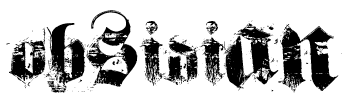
I don’t think this design could work as my mast head. While I
like the way the typeface looks, the ‘worn’ texture of it makes it too hard to
read. This may be useful as a smaller typeface used in another area of the
house style, but it does not work as a mast head.

I like this design, as it is similar to the first, but I feel
its less blocky design makes it too plain so it does not stand out as much as
the first design. However, as the typeface is very similar, it would be very
good to use this typeface for titles and such, as it will look very similar to
the mast head without being the same.
No comments:
Post a Comment