
Friday, 16 December 2016

Friday, 9 December 2016

Friday, 2 December 2016


Tuesday, 22 November 2016

Magazine Photography Analysis
Magazine Photography


This picture was my initial idea for the front cover, but after taking it, I feel that the dimensions of a magazine cover do not compliment the image very well, so it would not look very good. I may use these photos on the feature article page, but they will not be the dominant image on the cover.
The second two, where they are stood closer together work more, but if I were to use an image, I prefer how they look in the first images, so I would use a photo editing suite to move them closer together, as I still feel they could stand closer. During the photo shoot, they were not able to stand any closer due to the floor dropping off.


I will use these images two images on the contents page as other artists in order to increase the volume of content to seem more realistic. I think the suits are too messy to be usable on the feature article page as the band, but they may look good.

During the photo shoot, I had the idea of having the band wear masks, to maintain their mysterious image, but also be able to face the camera. We found two styles of mask, these deformed orange latex masks, and some solid emotion masks. They are both typically used in dramatic performances, so they fit the idea of the band being "performers". I much prefer the design of these masks, but they did not fit particularly well, so the image looks slightly off. I may use it on the contents page or feature article, but not the front page.

These are the other masks I found, and this is the image I will use for the front cover. I am not particularly fond of the masks, as they seem plain, but it will not be difficult to change their colours using a photo editing suite. Additionally, I would like them to be stood closer together, so they could take up more space on a magazine cover, so I will move them closer in editing. I will also change the background to be something much darker, in order to fit with the "metal" themes of the magazine.

I will use this image on the contents page as another artist.


I will not use these two images, as I have no need for them. I have photos for the contents page and the feature article, so they don't fit in anywhere.
Monday, 21 November 2016


Sunday, 20 November 2016
Feature Article Draft
Feature Article
Demon’s Blade, or 鬼の出刃 as they are known in Japan, are
the black metal power trio from the neon jungle of Kabuki-cho, Tokyo. They
consist of guitarist Kazuya, bassist and frontman Tatsuda, and the mysterious
drummer and vocalist known only as Oni,
or Demon. Having been on the Tokyo
music circuit since 2004, they have gained a large following that has stretched
as far as mainstream Japanese television. It has not however, spread as far as
the West. However, with their newest album, Raid
of Sound, Demon’s Blade are hoping to conquer the West and achieve, in
their words, “global domination”. We spoke to the man himself, Oni, about the
band, Raid of Sound, and his further
ambitions.
First of all, thank
you for joining me.
Thank you for having me.
I’ll start by asking
this: How did Demon’s Blade come about?
Well, I’d known Tatsuda since high school, and we’d tried to
make some visual kei style music and
perform it around 2001, but we could never really make any waves with it. I
think our problem was that we didn’t distinguish ourselves from other visual kei bands. We put the idea of
being a band on hold until we saw deadman
in Nagoya in late 2003. We hitched a ride there with this guitarist who
Tatsuda sometimes went to the arcade with. Long story short, that guitarist was
Kazuya and we formed Demon’s Blade not long after.
You mentioned
Deadman, which is also the title of your first album. Is that a coincidence, or
a homage?
Definitely a homage. We released Deadman around 2007, not long after the real deadman split up. A lot of our early stuff was inspired by their
sound, so I think we all subconsciously decided to record it as a sort of
tribute to our legends.
Is that album the
only name of yours inspired by something else, or do you hide a lot of
references in your work?
Funny that you ask that. Tatsuda is a complete nerd, and
loves video games, which I mentioned was how he met Kazuya. Anyway, whilst we
were spit balling about what to call the band, I tagged along to this arcade,
‘cause you could smoke in there. Anyway, there we all were, Tatsuda and Kazuya
playing this arcade game, when one of the characters shouts “The power of a
demon’s blade!” when he does his attack. We all sort of looked at each other,
and decided that Demon’s Blade would
be our name. As for any other references, buy our albums and find them yourself!
Were you trying to
find a new sound at all for this album, or simply improving what you’ve already
done?
I think we’re constantly trying to stay fresh in order to
please the fans, as well as not make the same mistake myself and Tatsuda made
the first time around. But in terms of this album, I think we definitely didn’t
want to experiment too much, to try to expand into new markets. Of course I say
that, but we definitely did try a couple new things with this new album.
Could you give us an
idea of what they were?
Well, this is our first properly studio recorded and
produced album, so we wanted to play around a bit with the new tools at our
disposal. One of the big things we did was change the sound of the guitars to
be much more intense, as we could channel the raw sound we were outputting
better in the studio. We also played around a lot with the balancing, to make
it sound really good on a car stereo.
Why was that?
So it would sound better on the radio!
Of course. As a
matter I can no longer ignore, what’s with the mask?
Heh, I thought you’d ask about that. Around the same time we
created the name, we were looking at the popular visual kei artists to see what we could… take… from their image. We
noticed that lavish make-up was becoming more and more common, along with slightly
sexual outfits. We were all down for the outfits, but I wasn’t on board with
the make-up. As we were thinking of something cool and original I could wear
instead, we walked past a costume shop that had a demon costume on display. The
mask was cool, so I bought it and just started wearing it when we performed. To
answer what will likely be your follow up question, we decided to wear suits
when we make appearances off stage to seem professional, but to keep the stuff
on our faces to stay recognisable.
That’s actually
really cool. As you’re not particularly well-known here in the UK, are there
any bands that you take inspiration from that could entice potential listeners?
Well, I think most of the bands we’re really inspired by are
just as unknown as we are in the UK, but if anyone has heard of X Japan, they’re
our main old-school influence. On top of them, we’re really big fans of
Concerto Moon, and while they’re pretty unknown now, put out some really solid
stuff that we want to build on. Of course, we want to emulate the greats, like
Slayer, Cliff Burton’s Metallica, Motörhead, stuff like that. Though I think
the best way to imagine us is if you took BABYMETAL, removed the whole kawaii
pop s***, and replaced the vocals with James Hetfield. Then you’ve got our
basic sound down, but we try to change the formula for what people expect from
metal, and try to fuse a lot of other genres into our work, so you can’t get a
perfect idea of our sound without hearing us!
Gnarly. How often do
you guys do live performances, and is there any chance of a UK tour?
We love doing live performances, so we end up doing them
quite a bit! I think we do our best stuff when we’re playing off an audience,
and we all enjoy being on stage, so we end up playing maybe 3-4 nights a week.
It sounds like a lot, but we do a lot of supporting act style stuff, along with
playing some smaller bars and such. We’re usually based in Tokyo, but we quite
often play in Nagoya, they’ve got a great music scene over there. As for a UK
tour, we’re planning on doing a full world tour if we get enough interest in
this album, and we’ll definitely throw at least three nights in the UK on
there.
So lastly, is there
anything you want to say to our readers?
I’ll say this – if you want something completely different
from the norm, something that is so far from the pop charts that it’s unaware
of their existence, check us out. If not, simply rock on.
Raid of Sound, by Demon’s
Blade, is available now on Spotify and iTunes, with a limited physical
distribution of CDs and Vinyl available December 8th.
Monday, 14 November 2016
Photography Planning
Photography Plan
For the front cover, the band will be stood in suits against
a dark background. This will create the ominous and mysterious atmosphere that
the band wants to have. The image will cut off at around the neck line, so that
their faces cannot be seen. The obscured faces of the bands will be a running
theme through the images, in order to make the reader intrigued as to what they
look like. It will also draw in people who may not necessarily want to listen
to a foreign band. Images for the contents page will have the band facing away
from the camera, to again make their identities mysterious for the reader. The
images for the feature article will be similar, but will feature the blue mask
that Oni wears in some capacity.
Feature Article Artist Planning
Artist Plan
The Band
The band Demon’s Blade have exceeded far past their origins
of Kabuki-cho, Tokyo. A black metal band, Demon’s
Blade consists of three members, who don themselves in lavish makeup, a
homage to their hometown known for its over-the-top performances. There is the
guitarist Kazuya, the bassist Tatsuda, and the drummer and vocalist Oni. These
are all stage names, another by-product of the birthplace of Demon’s Blade. Their strange infusion of
folk melody with wailing guitar and oppressive bass invokes feelings of bands
like Kiryu and Ensiferum, but the screaming guitar solos bring obvious influence
from bands such as Slayer and Cannibal Corpse. They manage to fuse old
and new in a way never seen before, bringing a fresh sound to the metal
landscape. Demon’s Blade have released two albums so far. Their first was
recorded in Kazuya’s garage, which encapsulated the raw, violent sound of black
metal. Their second was studio recorded, and perfectly infused their now iconic
sound with the production quality of a chart topper.
The Members
Guitarist Kazuya is a performer, plain and simple. He feeds
of the crowd’s energy in order to create his magnificently epic solos, while
keeping the crowd’s attention the entire time. His stage presence leaves
viewers in awe and shock, and his skill on guitar impresses his peers and idols
alike. Off stage, Kazuya takes a much calmer approach. His warm personality and
light sense of humour make him popular with people of all ages, and his
appearances on Japanese television reflect this.
Bassist Tatsuda is a similar character to Kazuya. He projects
a presence on stage that has not been truly seen since the great Cliff Burton.
His style drifts more toward crowd hype than pure, face-melting bass, and this
creates an incredible alchemical fusion of energy on stage. Tatsuda knows
exactly what to say and do in order to really rile up a crowd, a skill that is
under-appreciated by many modern bands.
The drummer known only as Oni, or Demon, is the real draw of
the band. Having founded the band in 2004, he has managed to stay completely
anonymous to everyone except his two band-mate. His ability to meld explosive
drums and haunting vocals with Kazuya’s symphonic guitar has captured the
attention of metal fans across the world. Oni never takes part in interviews or
TV appearances without his signature blue demon mask, creating the sense of
mystery that fuels the band’s popularity in the Japanese underground music
scene.
Their Appearance
The band takes a lot of visual inspiration from their home in
Kabuki-cho, and from the very popular Japanese genre called ‘visual kei’. For
their live performances, the band dresses in lavish garb predominantly made of
leather, the colours mainly being black with highlights in a brighter colour,
like purple or green. Both Kazuya and Tatsuda wear makeup in the ‘visual kei’
style, while Oni wears his blue demon mask. In photo shoots and TV appearances
however, they choose to wear suits and ties in order to look professional,
while still wearing their makeup and masks respectively in order to keep up
their mysterious image.

Why are they appearing in my magazine?
Dragon’s Blade are releasing a new album, titled ‘Raid of
Sound’, and are hoping to use it to kick-start their careers in the west. They
believe that appearing on the cover of and being featured in a magazine will
give their band the coverage they need in order to sell their album, and
perhaps organise a world tour.
Other band names for contents page and front cover:
Laceration Plague - A metal core band from the USA, popular for their high-energy live performances
Edition - A popular British metal band that has found some chart success.
Cobalt - An Eastern European metal band that produces albums with no lyrics. Popular among avant-garde fans.
Crescent Sun - A Mexican band that fuses mariachi with metal. Their music never sells particularly well, but their fun attitude is popular among most music fans.
Magazine Colour Scheme
Colour Scheme Planning

Looking at the results of my survey, I can see that the most popular choice of colour scheme was a combination of black, white, and yellow. Therefore I have decided to use these colours as my house style.

Black - I will use this as the base for backgrounds in my magazine. This is so the "dark" atmosphere created by the Metal genre is carried throughout the magazine through the visual style.
White - This will be used as the typeface colour, as it contrasts with the black background without being tacky.
Yellow - I will use this to highlight certain areas of my magazine, such as titles, sub-titles, and other areas like banners.
Red - This will be used to highlight small areas where the yellow would not stand out enough
Orange - This will be used for page numbers, website names etc.


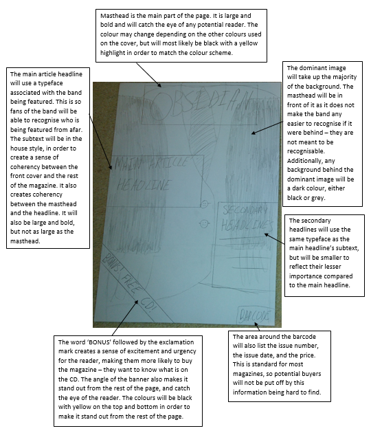
Masthead Ideas And Designs
Mastheads
I have created four possible masthead designs and analysed how good they would be as a masthead. I outlined my choice at the bottom

I like this mast head design. The typeface is easy to read
whilst still popping out at the reader. The Gothic styling fits with the tone
that the magazine should set, and it also reflects the tone of the material
being discussed within the magazine.

The typeface in this design is much too ‘fancy’ and uses too
much embellishment. This makes it hard to read, so I am definitely not
considering using it as my mast head. I feel that it is so inconvenient to
read, that I will not be able to use the typeface anywhere in my magazine
whatsoever. The preview of this design looked much better than the result.

I don’t think this design could work as my mast head. While I
like the way the typeface looks, the ‘worn’ texture of it makes it too hard to
read. This may be useful as a smaller typeface used in another area of the
house style, but it does not work as a mast head.

I like this design, as it is similar to the first, but I feel
its less blocky design makes it too plain so it does not stand out as much as
the first design. However, as the typeface is very similar, it would be very
good to use this typeface for titles and such, as it will look very similar to
the mast head without being the same.
I have decided to use the first design as my mast head as it
conveys the style of music through its gothic appearance. The blocky style also
makes it seem more raw, without being unreadable.
Ideas for my magazine's name
Name Ideas
Rocknroller – This name will grab the attention of both rock
and metal fans, however as I am making a metal magazine, it may not properly
convey the genre to potential buyers. I feel that, given the chosen genre, this
name is too vague and generic.
Metal – This name is much more accurate to the genre covered,
however it is a bit ‘on the nose’. It does not have any nuance or personality
to it, and this could put off some of the target audience, who may want a
magazine that feels like it has a personality and is ‘different’.
Black – This name has a bit more nuance to it. It refers to a
particular sub-genre of metal, called ‘black metal’. This name would convey the
genre, but only in the context of music magazines, and it is also quite plain.
Obsidian – This name is similar to ‘black’, and carries the
same dark connotations without being quite as literal. It is also specific
enough that it can be used as a brand, like Q. It is also not as broad as
‘Rocknroller’, so fans of rock and other genres, aka those outside the target
audience, are less likely to buy it and be dissatisfied.
Pickup – This name refers both to the component of an
electric guitar, and what you want people to do with your magazine. However, I
feel this is too vague and could possibly get confused with the confectionary
of the same name.
Loud Sound – This is a simple but effective title, it quickly
conveys to the reader the contents of the magazine. I feel that this name could
be good, but does not convey any specific genre past the fact that it is a
music magazine.
I have decided to use the name Obsidian, as while it does not directly convey that it is a music magazine, it does imply the genre when taken in the context of music magazines.
Monday, 7 November 2016
Magazine Readership Profile
Readership Profile
Character Profile:
David
is a Sixth Form student studying a wide mix of subjects. James feels that music
is a big part of who he is, as he enjoys being creative, but he also enjoys
appreciating a well-made piece of media, like a film or album. He thoroughly
dislikes pop music, as he feels it is “overproduced” and “doesn’t require any
talent”, so James listens to less mainstream genres, but his favourite is
metal. He mainly listens to music on his phone, as the bands he listens to are
not popular enough to be sold in the shops, as they are either incredibly
unknown or from a different country like Finland, Sweden, or Japan. Therefore
he spends the money he earns from his part-time job on concert tickets or
equipment for his guitar, like effects pedals. He enjoys playing and writing
music with his guitar, and spends most of his time either playing music or
talking to his friends, who have a similar taste to him.
Mood Board:

Initial Ideas for a Music Magazine
Initial Ideas for a Music Magazine
My chosen genre for my music magazine is at the bottom of this post.
Idea 1 – Metal magazine:
- · Target readership is slightly wider than the usual for a music magazine, as it is males between the ages of 16-35. This is because a lot of metal bands have been consistently making albums since the 1980’s (such as Slayer and Cannibal Corpse), who still have a large amount of fans. Additionally, there are new bands who appeal to the younger generation, and traditionally these are both covered by metal magazines, as only covering one limits the target audience too much to be profitable.
- · The style is usually darker than most music magazines and creates a brooding atmosphere. This is because the aesthetic of metal is almost always dark, and often has satanic undertones (or overtones depending on the subgenre).
- · The colour scheme is dark, and predominantly uses black with white for text, and washed out colours to highlight feature articles and the mast head.
- · A metal magazine’s articles would mainly be about new albums from artists, either reviews or features. There would not be any gossip, as metal fans are not interested in it. Articles may also cover older albums, either to talk about what made them successful, compare them to newer material from the same artist, or to review how well it has held up over the years.
- · The font is usually quite Gothic in order to fit with the dark theme.
Idea 2 – Rock magazine:
- · The target readership for a rock magazine is younger than that of a metal magazine, and it can also be aimed at both males and females between the ages of 16-25. This is because many modern rock bands are focused on their image as much as their music, which appeals to younger people more than older people.
- · The style is usually very bright, to create an exciting tone to the magazine. Almost all of the material covered in a rock magazine is new, so the exciting tone links to and reflects this.
- · The colour scheme is usually very bright for a music magazine. A common colour scheme is white or light grey for the backgrounds, black for the body of text, and red for mast head, titles, and highlighting. Red is often used as it as multiple meanings, it can either be love or passion, or it can be danger, or excitement.
- · The articles in a rock magazine are almost all about something new, whether that be a new artist, or a new album from an already famous artist. Older material is almost never covered outside of “special edition” magazines, as new material is what sells.
- · The font in a rock magazine is mainly simple, perhaps with more exciting fonts for the mast head or the titles of articles. This is because the tone is mainly set with the colour scheme, so the font is kept simple so it is easier to read.
Idea 3 – Pop magazine:
- · The target audience for a pop magazine is usually quite young, to reflect the age group that pop music is aimed at. This is usually males and females between the ages of 14-21, perhaps more toward females than males. This is because pop music traditionally uses techniques that are pleasant to listen to, such as generic chord sequences, and younger people are less likely to be bored by this, compared to other age groups.
- · The style is usually very exciting, to fit the almost flamboyant atmosphere that modern pop music artists convey.
- · The colour scheme uses a myriad of colour in order to seem exciting, so colours like red or blue are sometimes used as background colours, with text in either black or white. The mast head and feature article titles could be any colour, but it usually fits in with the colours used in the rest of the magazine.
- · The articles are always about new artists or albums in a pop magazine, as older albums are no longer popular, and do not appeal to the audience who would potentially buy a music magazine.
- · The font in a pop magazine can vary from ‘incredibly eye-catching but hard to read’ to ‘very easy to read’.
Looking at the survey from my research, the most popular
genres are Metal and Rock, however as there are very few Metal magazines
compared to rock magazines, I have decided to create a Metal magazine.
Monday, 31 October 2016
House Style analysis
House Style Research and Analysis
The house style of a magazine greatly affects the overall tone and allows the editors to appeal to an audience without printing a single word. This means that identifying and understanding how a house style is used makes all the difference when the design phase is reached. In order to accomplish this, I have analysed two music magazines for their house style, which can be viewed HERE.
Thursday, 20 October 2016
Target research and Focus Group
Target Research Survey Analysis
I created a survey of questions based around music magazines, and asked 14 people between 16-21 to give answers about what they would want from one. In order to make the data accurate, I covered a number of different aspects relating to music magazines. I can then use this when designing my music magazine in order to appeal to the right group of people.

The answers to this question tells me that people listen to a wide variety of genres, with the most popular ones being Rock and Metal, with Metal being substantially more popular. This was not the result I was expecting, as I thought Pop would be the most popular, as that is the most featured genre on TV and radio. I believe this may be due to my focus group not being an even representation of the whole population, but rather a small subset. However, I will still use the result this data has given me to plan my music magazine, which will try to appeal to fans of Metal.

I asked my focus group how often they buy music magazines to gauge how important a decision they make when buying one. My results show that the vast majority of my group bought music magazines less than once a month, so when planning my magazine I need to ensure that it is appealing enough that they will buy it. This result does not surprise me, as the advent of the internet means that most people between 16 and 21 get their information online, instead of in print.

This question was to give me an indication of what combination of style and substance appealed to my group the most. The answers I received tell me that Rolling Stone's combination of music and other areas of pop culture appeal the most to people, which tells me that it may make my magazine more appealing if I put in articles about popular film or TV alongside music. It also tells me that people do already buy music magazines specific to the Metal genre, so my magazine will have competition in the market.

This question was to give me an indication of what sort of content would appeal to my audience the most. The results show that a wide variety of articles would interest my target audience, but the most popular would be album reviews, gig information and interviews. This lines up with what I expected, as this is already what most music magazines create in order to appeal to customers and stay relevant in the digital age.

The last few questions were specifically about house style, and what would appeal to my audience. The first, on the design of the front cover, gave me an even split between messy and organised. This means I will have to make a compromise and not be able to appeal to everyone, however due to the nature of Metal as a genre, I will have already put many people off with the subject matter. Therefore I have decided to make my cover organised, but with exciting fonts and colours. This is because, while Metal carries connotations of chaos and disorder, people like to see things that look organised, and this makes the information easier to process. My target genre being as specific as it is, it is better to make the information easy to read while still being eye-catching, rather than going all-out on making it stand out.

The next question on house style was about colour scheme. I came up with four styles that I felt would look good, but by far the most popular choice was my initial idea of black, yellow, and white. I came up with this by looking at the general styles of other magazines like Q and Metal Hammer, so it does not surprise me that the colour scheme that draws most from other popular magazines was the most popular choice.

The final question was a simple one to do with the style of font. This seems to be mainly down to personal preference, however as Serif was the more popular choice, I will use a Serif font for the masthead and cover lines, then use a Serif Sans font for the actual article text, as I feel that Sans Serif is easier to read when it is at a diminished size compared to Serif.
Focus Group
I asked a small group of my peers this question:
Why would you read read music magazines?
And these were their responses:
- "To know about new bands and when new music is coming out."
- "When concerts are"
- "Exclusive interviews with bands"
- "to find new music I would like"
Feature article Analysis
Analysis of Double-Page Spread Feature Articles
I have analysed two double page spreads. They are both from Q magazine, I realize now, however they are from different issues and have a very different style to each other. The analysis can be viewed HERE.
Wednesday, 19 October 2016
Contents Page Analysis
Contents Page Analysis
I have analysed two contents pages of music magazines, Q and Metal Hammer. My analysis can be seen HERE.
Monday, 10 October 2016
Effect of the Internet on the Music Media
Effect of the Internet on the Music Media
The rise
of the internet drastically changed the way that the music media had to operate
in order to stay relevant. Before the internet, music magazines were the best
way to find information on bands that you were interested in, as well as find
new music and see the music charts. The internet made this information easily
available to people, so music magazines had to adapt to survive. Many music
magazines have changed their format in a bid to stay relevant. For example, NME
is now a free magazine to incentivise more readers and many magazines such as
Metal Hammer and Rolling Stone publish their articles in a print magazine, and
then online a few weeks later, meaning those who are eager for the information
will still buy the magazine, but those less interested will read the online
piece and generate income through things like ad revenue.
Social
media and video sharing platforms mean that new artists have a much easier time
being discovered than before the internet, two modern examples of this being
Justin Bieber and Ed Sheeran. This means that music media moved from covering
new artists that were playing in their area, to finding people sharing their
music online and introducing people to them. Additionally, the ease of
communication between like-minded people over the internet means that people
can find artist recommendations more easily than before, making the media’s
recommendations less meaningful.
However,
the rise of the internet has also helped the music media. Having almost every
song available to listen to on the internet means that the media no longer have
to describe the sound of a band, they can simply show their audience. This also
gives the consumers of music media instant gratification, they can immediately
see whether or not they like a band with little effort required, instead of
having to buy or hunt down an album or recording as they did before the
internet.
Before magazines embraced using the internet, many sites dedicated to bands were run by fans, and were therefore sometimes inaccurate or not kept up-to-date. The convergence of technology means that magazines can now be produced digitally and look exactly the same as their print versions, creating synergy between them that allows for the target audience to access the content more easily than ever before. This also created the need to increase the quality of the journalism in music magazines, as digital magazines can be distributed much more easily than print magazines, so they rely more heavily on fans, so unique selling points are more important.
Before magazines embraced using the internet, many sites dedicated to bands were run by fans, and were therefore sometimes inaccurate or not kept up-to-date. The convergence of technology means that magazines can now be produced digitally and look exactly the same as their print versions, creating synergy between them that allows for the target audience to access the content more easily than ever before. This also created the need to increase the quality of the journalism in music magazines, as digital magazines can be distributed much more easily than print magazines, so they rely more heavily on fans, so unique selling points are more important.
Monday, 3 October 2016
Readership Profiles
Readership Profiles
Rolling Stone

Rolling Stone
magazine sells approximately 1.4 million magazines a year. 61.7% of its adult
readership is male, and 50% of sales come from 18-34 year olds.
Metal Hammer

Metal Hammer is a
metal music magazine with a yearly circulation of 20,961.
NME Magazine

New Musical Express
is a music magazine created in 1949, and went free in 2015. Pre price drop it
had a circulation of around 15,000, and has a post price drop circulation of 300,000.
The magazine is aimed at both men and women, judging
from the models used on the cover. Palma Violets are a modern Indie Rock band,
which is a genre appealing to both men and women, specifically those between
16-25. The secondary cover articles also cater to both men and women’s taste,
with bands like Foo Fighters and Florence + The Machine. This magazine’s Social
Grades are ABC1, as these are the Grades who are interested in the music
covered in the articles, and have the time and money to go to the concerts
advertised on the cover. However with the price drop, classes C2, D, and E may
also read the magazine, even if nothing directly appeals to them, meaning some
ads may be targeted toward them. The magazine covers a wide variety of musical
genres, unlike Metal Hammer, but unlike Rolling Stone, their articles are still
mainly about music. With their change to a free magazine, NME has moved towards
more pop-culture orientated articles, obviously in an attempt to attract more
readers. The age range for readership is similar to that of indie music, so
16-25, as they are most interested in the new music covered in the magazine.
Older people may also be appealed to, mainly because of the lack of a price tag
rather than the content being covered is meant to appeal to them. The
personality types of the readers would be Aspirer and Mainstreamer, as Mainstreamers
like following trends, which are covered by NME, and Aspirers are inclined
towards image and appearance, which is again covered by NME magazine.Monday, 26 September 2016
Analysing music magazines
Analysing the front covers of music magazines
The front cover of a magazine is important, as it is used to grab a potential reader's attention and hold it. To do this, they use many different techniques, which I have analysed in THIS document.
Sunday, 18 September 2016
History of Music Press
History of the Music Press
1950's
In 1952 NME (New Musical Express) launched.
1960's
Music journalism changed in the 1960’s with the Beatles, drug culture, and in 1967, Rolling Stone magazine. This contained coverage of the music industry, along with interviews with celebrities and current affairs, making it stand out from previous publications. It also appealed to a youthful audience, as it saw music as a culture rather than just entertainment.
1970's
The 70’s brought new genres like glam and prog rock, which changed the way music magazines reviewed music. As prog rock bands began spending more money on the effects of their performances, magazines became critical of them. NME moves away from writing about just music to writing about the politics and philosophy of songs, especially the burgeoning punk movement. This created a split in music journalism between magazines covering “real” music and technique like Melody Maker, and the “new” style of magazine like NME. Music culture also became more focused on the band’s image rather than the music, which was helped with the release of Smash Hits magazine in 1978. This was aimed at a younger audience, and contained “personality” interviews and band gossip, adding to the image of bands.1980's
The rise of music videos and the launch of MTV in 1981 saw a change in direction for what was popular. Bands could now become famous with a flashy music video, such as Dire Straits’ “Money For Nothing”, which changed the market that music magazines could fill. Independent music labels would produce “fanzines”, such as “Sniffin’ Glue”, which covered emerging trends or gave smaller bands a voice. Magazines that focused more on fashion than music also appeared, including “The Face” and “Blitz”. Magazines with similar styles to Smash Hits, but covering other genres than pop. These included Kerrang! Magazine in 1981 and Metal Hammer in 1983.
 1990's
Music videos continued to grow into the dominant platform for exposure in music. MTV moved away from showing just music videos to showing other types of TV such as reality and game shows. Music magazines began to decline in popularity as more major publications such as newspapers began reviewing music.
2000's
The rise of the internet and social media has meant a sharp decline in sales for music magazines. Many magazines now publish their articles onto websites which can easily be shared, with the few kept as print exclusives ending up online later. Video streaming sites such as YouTube and Vimeo have also made accessing music videos easier than MTV, causing it to focus on its reality programmes. Major newspapers such as The Guardian now publish music reviews and news alongside everything else, showing that music has now become a part of mainstream culture.Friday, 16 September 2016
Evaluation
Preliminary Project Evaluation
In my front cover, I have
both used and challenged conventions. For example, I have used the convention
of having cover lines consist of a larger phrase to catch the reader’s
attention, and then a longer phrase underneath expanding on the subject. I
challenged the convention of having the masthead at the top of the magazine
with the slogan above or underneath by having the masthead down the side of my
magazine with the slogan perpendicular at the top. I chose to do this so that
my magazine stands out from the standard design, but not too much as to be
confusing and put off potential readers.
I believe my front cover
has turned out well. Comparing the final image with the image I started with,
you can see that I managed to increase the overall quality of the photo, as
well as turn it into a magazine cover.


I feel that my choice of
house style could have been improved, as I did not factor in the colour of my
background in the design stage, so the colour of the text did not show up well
without a black or white outline. I also feel my choice of font did not fit the
type of magazine I was looking for, as it was too bland.
I think that my time
management could have been improved, as at the beginning of the project I did
not have the focus I have at the end. If I had started with the mind-set I have
at the end of the project, I could have spent more time on creating my front
cover. Although I am happy with how it came out, I still feel I could have
improved it more.
For my main coursework
portfolio, I need to begin with the correct mind-set, in order to maximise the
time I have to complete the project. Additionally, I should plan the cover
photo and background, along with the layout and design of the front cover,
before deciding on a house style, allowing me to properly co-ordinate the
colour scheme. I should also focus somewhat on the smaller details of a
magazine cover, which will allow me to create a more accurate and believable
image for my portfolio.
Thursday, 15 September 2016

Photography and Design Plan
Photography and Design Plan
Photography
For my photography, I will have a single model posing on a background of bricks. The bricks will be the main background, as it creates a similar atmosphere to around the school, and, while it is still exciting, it is plain enough that it will not make the magazine design hard to look at. The image will be from a worms-eye view, to create an air of drama and excitement. The model will be at a slight angle from the camera, which will create mystery in the image. The model will be someone in Sixth Form so the cover is relatable to the audience.Cover mock-up

Features and Articles
On my front page, I will have three articles featured. the first will be about the model, meaning people immediately know his name, even if they only vaguely knew of him before. The secondary article will be on a topic that most people can relate to, so I have come up with 3 ideas:
- Netflix = Satan?
- How video games can increase your reaction time
- Study music - Yes or No?
I decided to go with "Netflix = Satan?" as this grabs the reader's attention the most, and is also the most "mainstream" topic out of the three, so the largest amount of people in the target audience will be able to relate to it.
The third article will be on upcoming events at the school, and will give a brief list of the biggest events.
Subscribe to:
Comments (Atom)